Flourishing a Cool Coffee Brand Through New Unique Illustration and Animations
Deliverables
Brand Identity
Packaging Design

Mission & Challenges
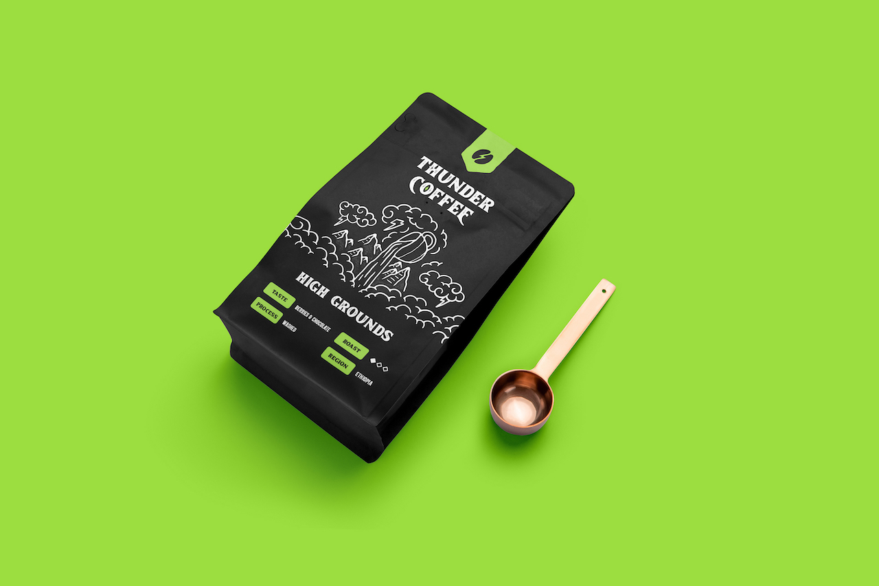
Vivian wanted something along with the logo, to go outside the box and not use classic sticker labels for the pouches, but rather design something differentiating that will be her trademark along the way.

The Output & Impact
%
Brand Awareness
%
Revenue Growth
%
Customer Engagement
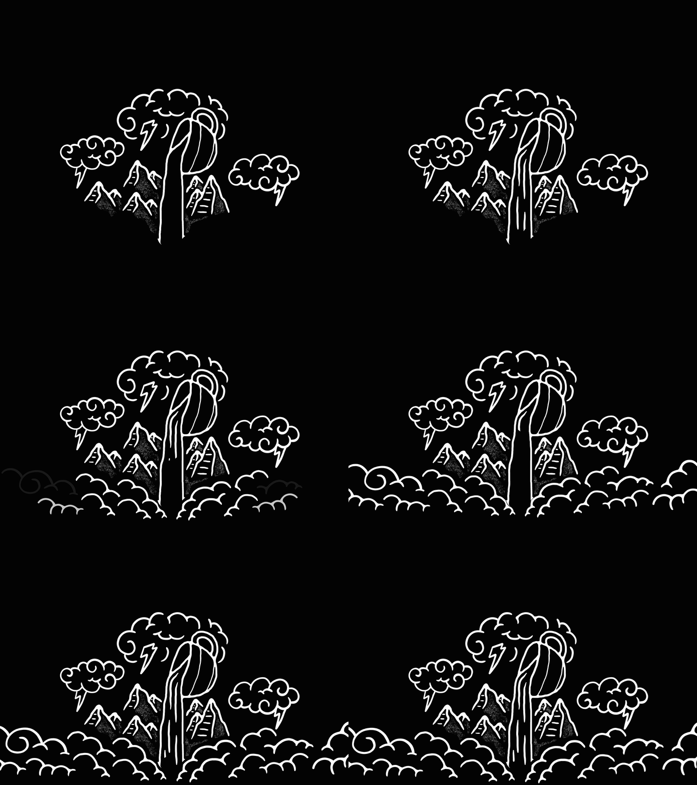
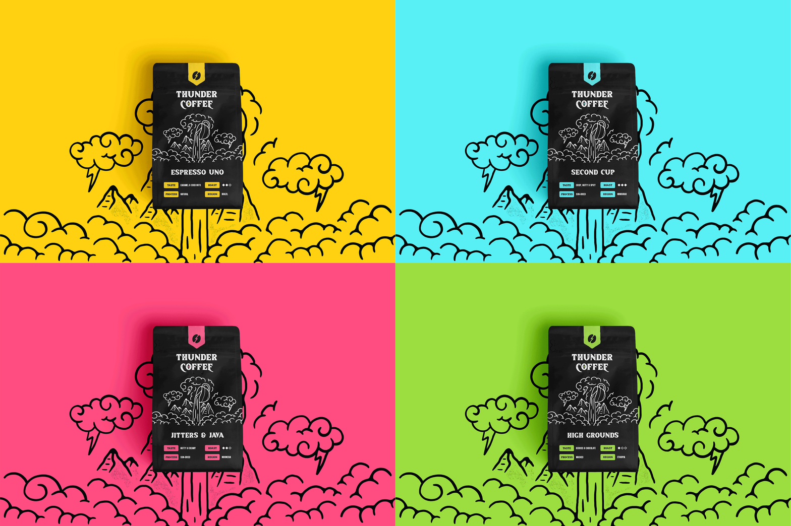
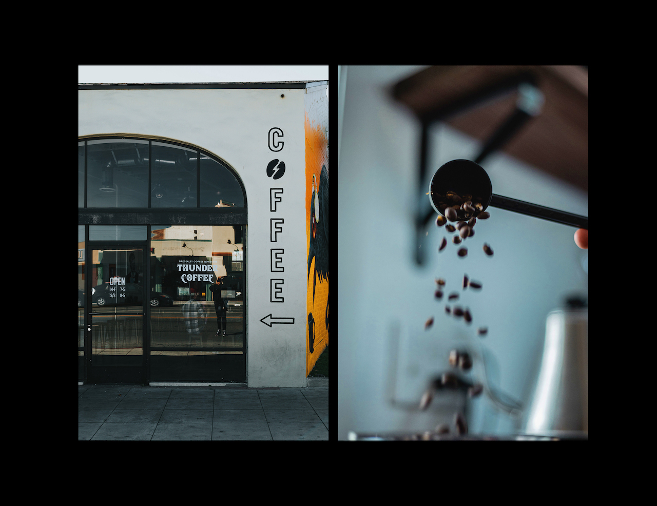
After exploring a few style approaches, we ended up with a cool coffee bean combined with thunder as a main symbol, paired with the grungy and bold typography. Along with that, we’ve made a cool background illustration that conveys the story of ‘coffee factory’ under the rocky Nevada terrain surrounded by thunders. Each coffee flavour is organized by colors of country’s origin.
2 months after brand launched, they are thriving and growing their sales, month by month. Vivian is more than satisfied and wants to work on her website to expand the sales online and influence any stores and bars around her place. The next goal is also to expand throughout the US and establish a solid spot in the coffee industry around US and neighbours.
Client’s Words
– Vivian J. King / Thunder Coffee
Free PDF file for Lorem ipsum dolor sit amet, consectetuer adipiscing.
Lorem ipsum dolor sit amet, consectetur adipiscing elit, sed do eiusmod tempor incididunt ut labore et dolore magna aliqua. Ut enim ad minim veniam, quis nostrud exercitation ullamco laboris nisi ut aliquip ex ea commodo consequat. Duis aute irure dolor in reprehenderit in voluptate velit esse cillum dolore eu fugiat nulla pariatur. Excepteur sint occaecat cupidatat non proident, sunt in culpa qui officia deserunt mollit anim id est laborum.
