Establishing a New Cannabis Brand With a Cool Name and Messaging
Deliverables
Logo Design
Packaging Design
Social Media

Mission & Challenges
Brand Naming, Personas & Design
We presented 4 different names to Josipa, and after a few days of reviewing and visualizing potential identities, we settled on KushajMe. The name originates as a mixture of English and Croatian language, basically combining a Croatian verb (kušaj me, eng. Try me) and the word Kush which is one of the slang for Cannabis.
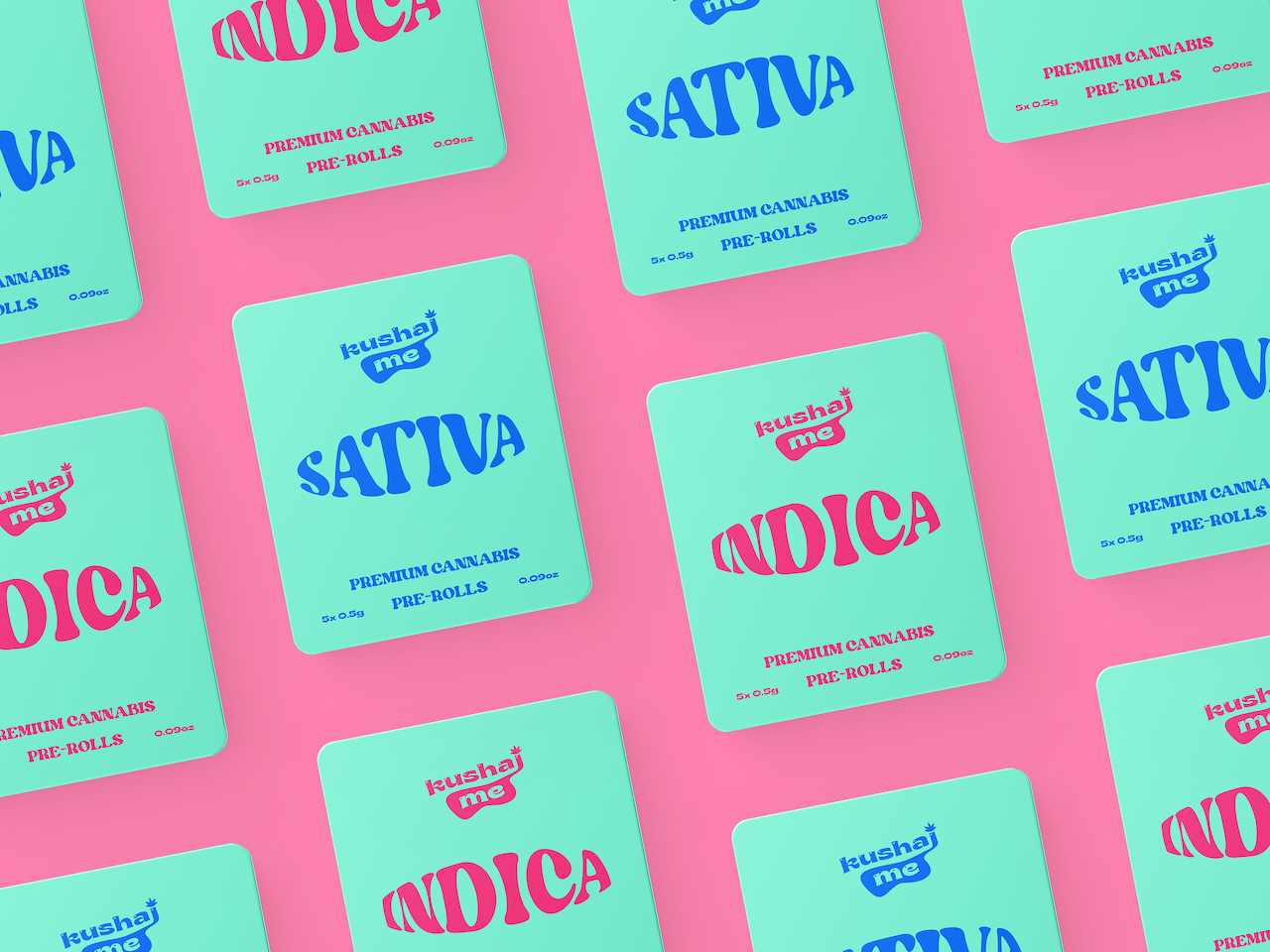
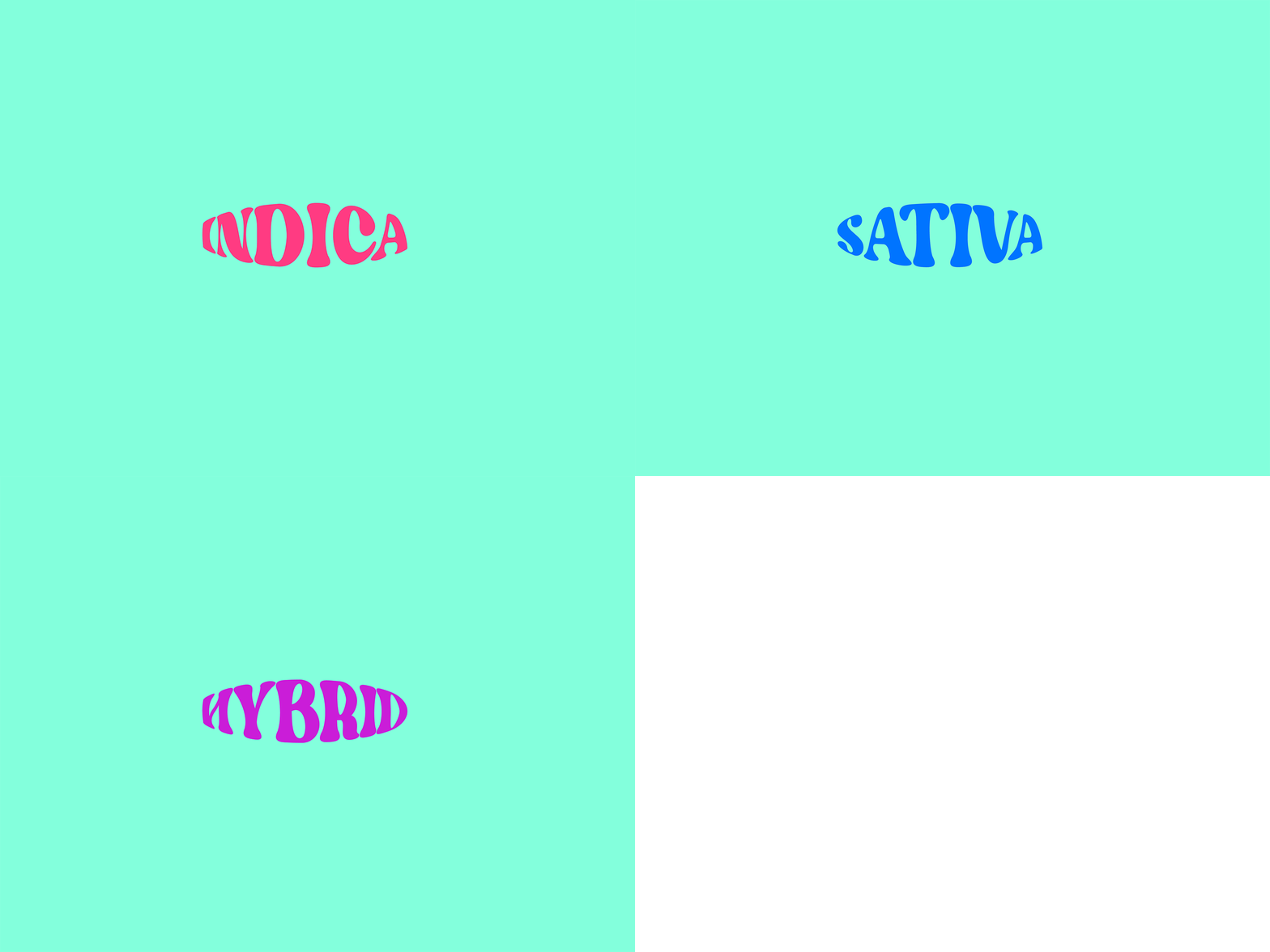
Regarding the design, we wanted to create something that will resemble relaxation and enjoyment, without placing too much emphasis on the cannabis and leaves symbols.
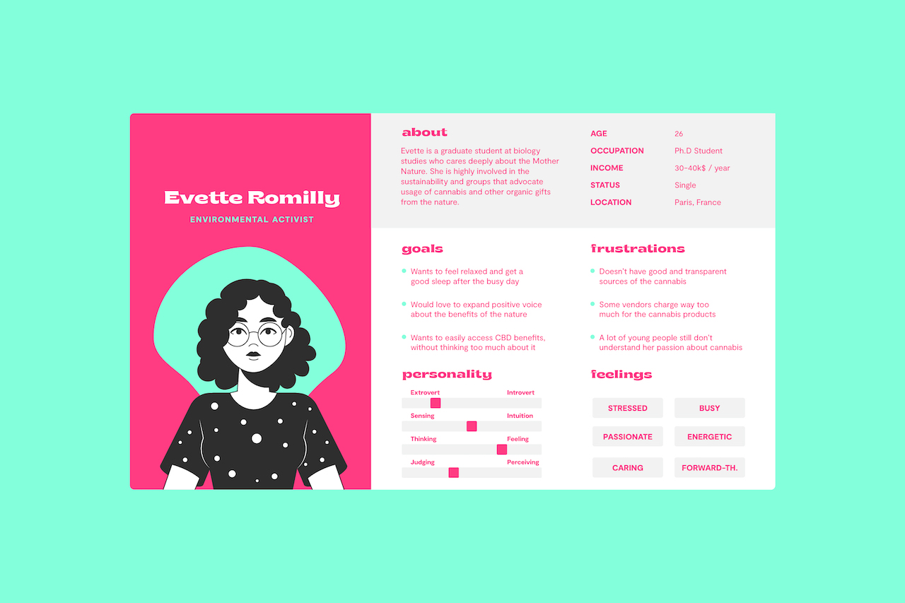
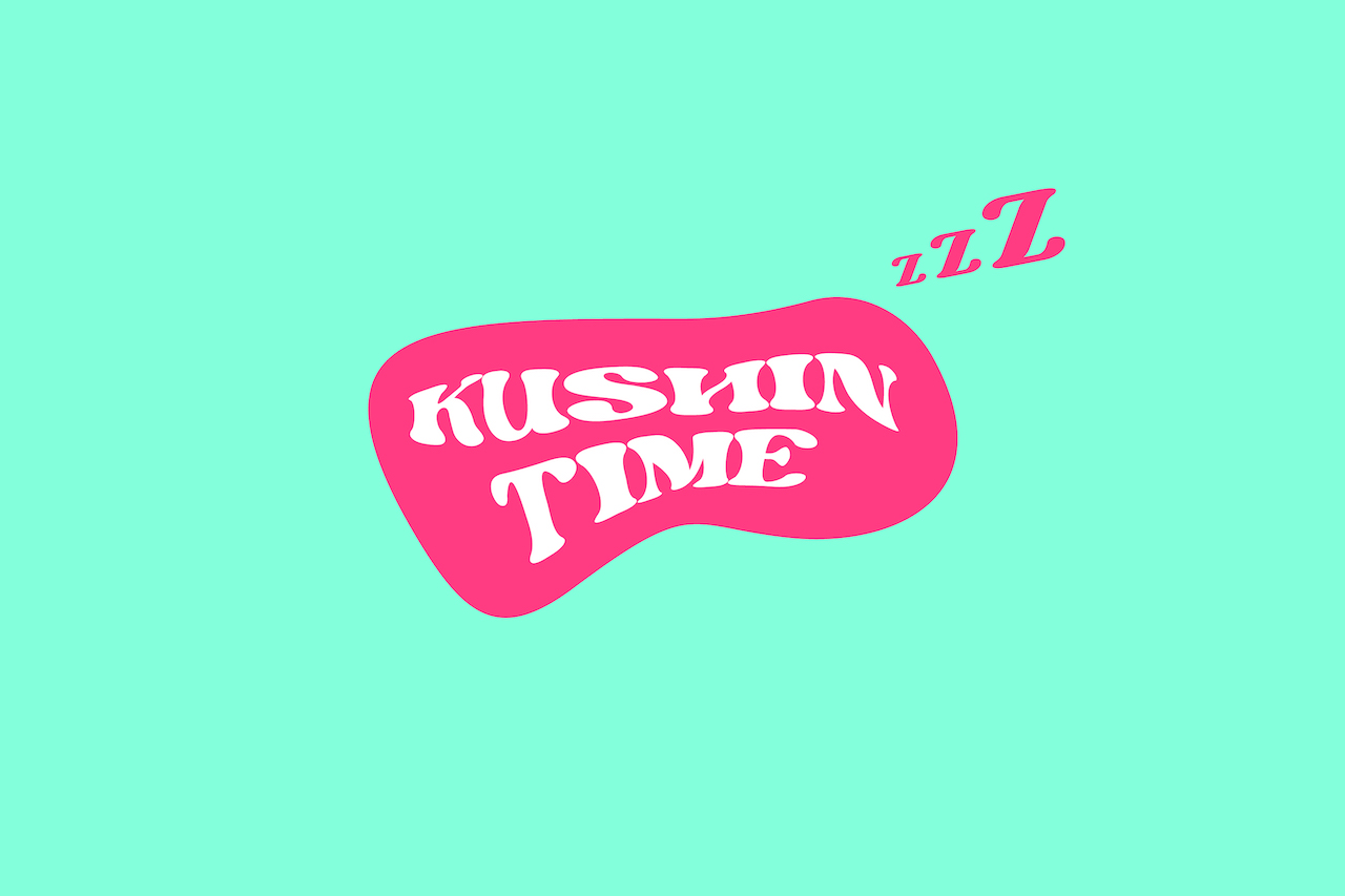
As their target audience are youngsters between 18-30, a bit hippie and atypical, we wanted to catch their attention with something that is slightly psychedelic and vibrating as well. Basically, portraying the brand as cool youngsters as they are, but in this case, they are cool providers of organic and high-quality cannabis heads and pre-rolls.
The Output & Impact
%
Brand Awareness
%
Revenue Growth
%
Customer Engagement
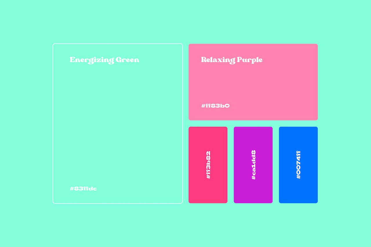
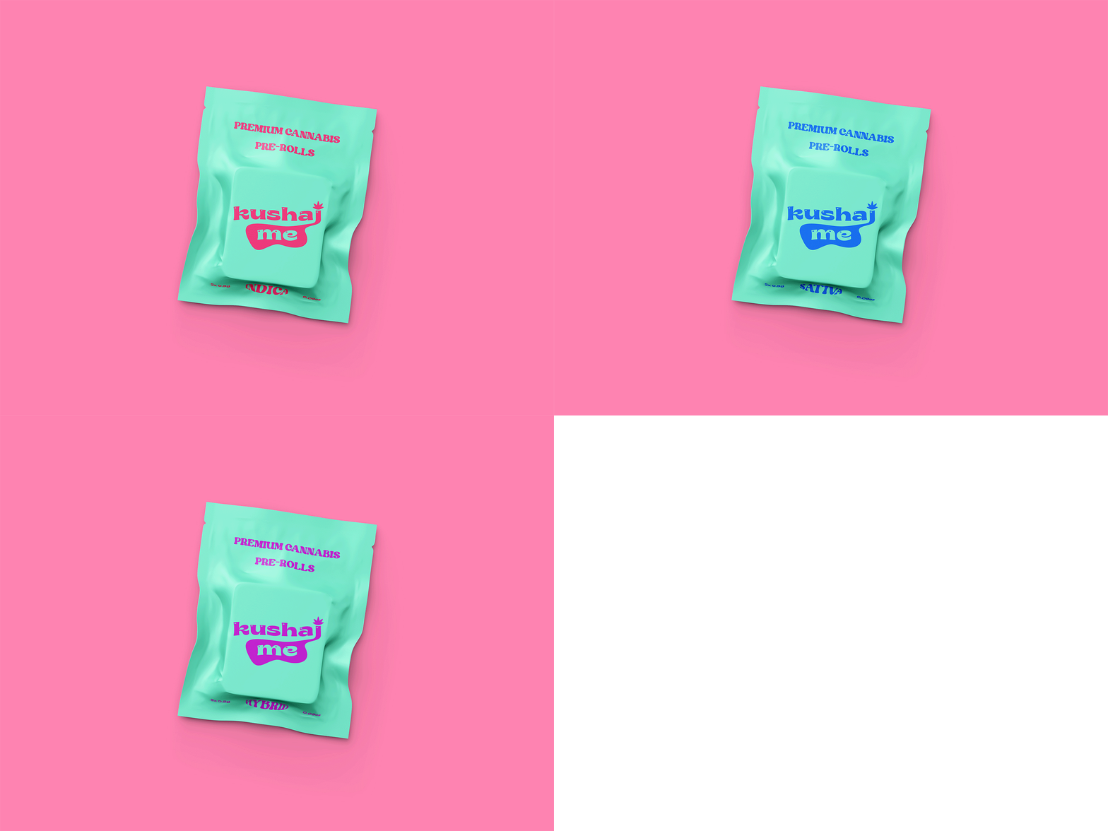
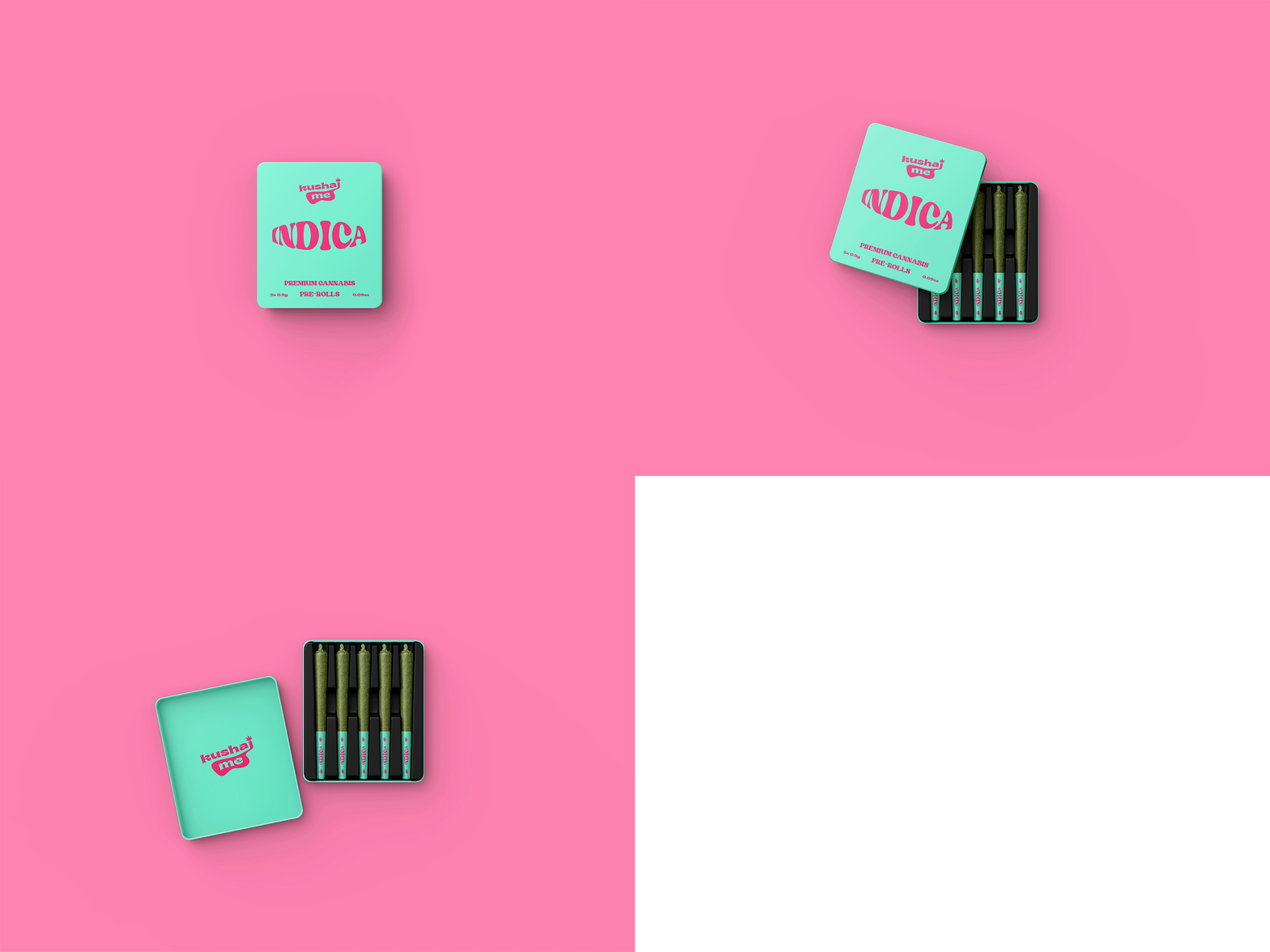
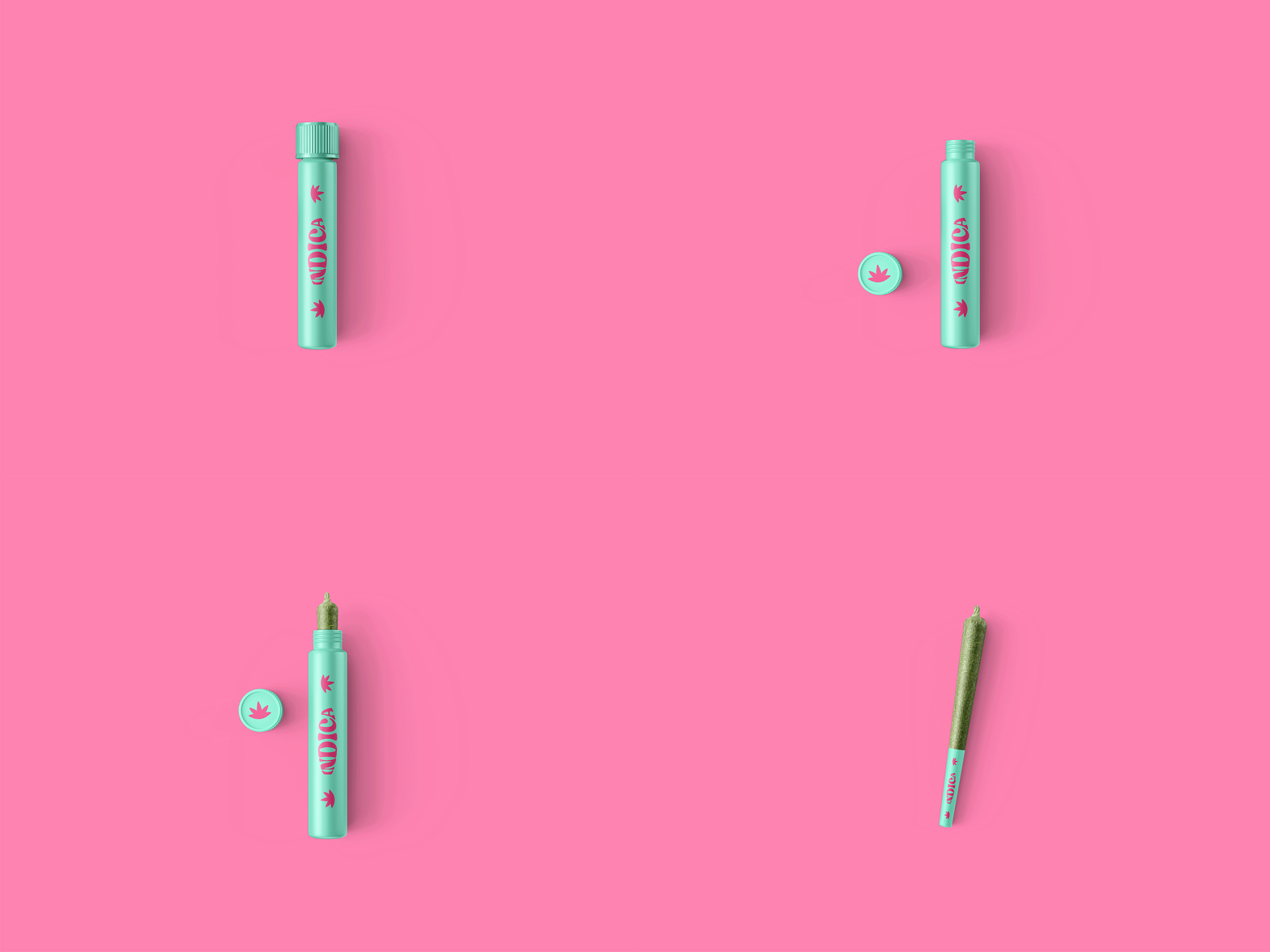
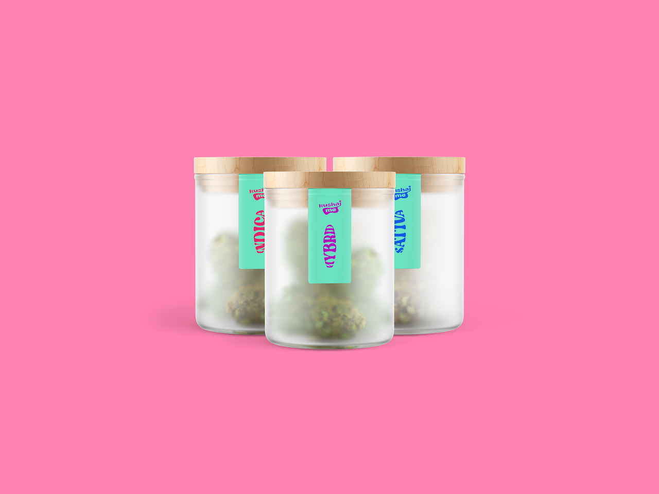
The outcome was amazing, a simple and vibrating identity that lovely translates throughout the packaging by using 1 main color combo (vibrant green and pastel pink) with 3 different shades for each strain. The color palette is accompanied by bold hippie typography and clean paragraphs.
Client’s Words
By working with Ivan and his team we’ve accomplished something that I’ve always dreamt of, and I still can’t believe that now I own a legit brand that is so well crafted and positioned. I’ve been in the cannabis industry for last 6 years working as a brand manager/consultant for one of the largest EU cannabis brands, which gave me the knowledge and experience, but now I finally decided to step on my own. Ivan was not only great as a project leader, but also made sure that me and Anita are heard, all of our ideas and suggestions. Besides that, I’m glad that he shares the same values as we do and greatly understands the cannabis industry. So in the end, not only we got an amazing design, but met a cool guy who also gave us some other business suggestions which are highly appreciated!
– Josipa, Co-Founder at KushajMe
Free PDF file for Lorem ipsum dolor sit amet, consectetuer adipiscing.
Lorem ipsum dolor sit amet, consectetur adipiscing elit, sed do eiusmod tempor incididunt ut labore et dolore magna aliqua. Ut enim ad minim veniam, quis nostrud exercitation ullamco laboris nisi ut aliquip ex ea commodo consequat. Duis aute irure dolor in reprehenderit in voluptate velit esse cillum dolore eu fugiat nulla pariatur. Excepteur sint occaecat cupidatat non proident, sunt in culpa qui officia deserunt mollit anim id est laborum.
